

Japan used pure blue light instead of green at traffic signals
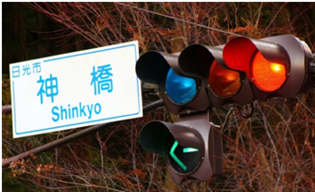
Have you ever seen a blue light on a traffic signal? The answer (japan traffic lights) must be a ‘no’. But some years ago Japan used mythical blue traffic lights in some areas.
Japanese Government set blue light as “go” signals in their street light due to their linguistic obsession. Japanese is the language that used the same word ‘ao’ for both the green and blue colors. But now the modern Japanese language says that ‘ao’ means blue and ‘modori’ refers to green. On the other hand, the official ”Go” color of a traffic light is called ‘ao’ even it is a perfect green.
Till 1968, the Japanese government did not accept the standardized traffic signals. In 1973, they decided that traffic light should be green. From then, they are using the bluest shade of green in the traffic light. But when it comes to (japan traffic lights) the licensing test, the Japanese drivers have to distinguish between red, yellow, and blue in their vision test part.
About the Author








Brat Generator Online makes it easy to create brat-style text visuals instantly.
Our expert team at Restore Old Photos uses state-of-the-art techniques to restore your old pictures to their original quality
Concrete Calculator is a free online tool that helps you quickly estimate concrete volume for slabs, footings, and foundations.
Ai Photo Enhancer enhances images by increasing clarity, sharpness, and details.
HEIC to JPG is a free online tool that allows anyone to quickly and easily convert HEIC images to JPG format.
AI Image Editor is a powerful AI image editor for restoring and enhancing images.
This online square face generator is the best Picrew alternative in English — create adorable square face icons for social media and game development
Brat Generator – Free Online Brat Style Cover Text Generator.
With Restore Old Photos, you can easily repair damaged, faded, or torn photographs and preserve them for future generations
Fascinating how a linguistic quirk led Japan to use a distinctively bluish green in traffic signals — it really shows how cultural and language norms can shape even the most standardised systems. It reminds me that perception and interpretation play a huge role in how we understand the world, from traffic lights to personal insights. If you’re curious about what your own unique lines and patterns might reveal about your character and future, you might find a AI-driven palm reading analysis surprisingly insightful — no need to rely on green or blue, just a photo of your hand.
That’s a really interesting piece on Japan’s traffic light color quirk — I never realized the linguistic tie between ‘ao’ and green was so deeply embedded in their road rules. It makes you think about how color perception and terminology can influence practical design choices across cultures. In my own work with scientific data visualization, getting the exact shade right is crucial for clarity and accessibility. I recently came across a tool that streamlines this process by letting you generate publication-ready figures and data charts from simple prompts, complete with support for custom color palettes like those used in colorblind-friendly schemes. It has made my workflow much faster, turning tasks that used to take half a day into just a few minutes. If you often create scientific illustrations or flowcharts, you might find this free scientific illustration tool useful for maintaining color accuracy and saving time.
Great article — the interplay between language and color perception in Japan’s traffic signals is a perfect example of how deeply embedded cultural norms can override international standards. It reminds me that learning a new language often involves rethinking such everyday concepts, which is why I’ve been using interactive Chinese learning games to practice Mandarin. The immersive, game-based approach makes it easier to internalize vocabulary and tones without relying on rote memorization. For anyone interested in how language shapes our view of the world, coupling linguistic study with playful tools can be surprisingly effective.
I found this piece on Japan’s traffic lights fascinating—it really highlights how language and cultural norms can influence even the most standardized systems. The shift from a true blue to a bluish green is a perfect example of perception shaping reality. It reminds me that in many fields, including scientific research, the tools and frameworks we use are often shaped by subtle biases or historical quirks. For those exploring how AI and data science are evolving to help researchers cut through such complexities, a great resource is AI tools for scientific research, which aggregates news, tools, and insights to keep scientists updated on AI-driven methodologies.
This is exactly the kind of technical analysis I’ve been looking for! The way you break down complex architectures is a real talent. P.S. If you need quick photo blurring, https://blurphoto.net/ works great.
Good perspective. I found free scientific illustration tool relevant when reading about paper-banana.
This is absolutely fascinating! I’d heard whispers about Japan’s unique approach to traffic lights, but never understood the linguistic and historical context. It’s amazing how language can subtly influence such practical aspects of daily life. The detail about drivers distinguishing “blue” on their licensing test really highlights how ingrained this cultural nuance is. Thanks for sharing such an insightful piece! I’m always looking for interesting facts, similar to how I’d approach complex calculations with a BA II Plus Financial Calculator.
I enjoyed reading “Traffic Signals Lights-The Reality of Japan Traffic” because it turns a specific subject into something approachable and easy to follow. The practical details and personal perspective give readers a useful reason to pause and think beyond the headline. That attention to small visual signals also reminded me of Sprite Tracker, a light example of how one simple movement can carry a surprising amount of meaning. Thanks for sharing such a thoughtful and clearly presented piece.
This was such a fascinating read! I had no idea about the linguistic connection between ‘ao’ for blue and green in Japan, and how it influenced their traffic lights. It’s amazing to learn about the cultural nuances that shape everyday things like traffic signals. Thanks for sharing this unique insight – it’s definitely going to stick with me. I appreciate discovering such interesting facts from Block Poster!
This was an incredibly fascinating read! I had no idea about the linguistic connection between blue and green in Japanese, or that the traffic lights once leaned more towards blue. It’s amazing how cultural nuances can influence something as universal as traffic signals. Thanks for sharing these insights! I always enjoy learning new things like this; it’s almost as useful as a precise Square Feet Calculator for understanding the world around us.
https://www.kalkulator-pracy.pl
Serwis pomaga w obliczaniu godzin pracy, czasu zatrudnienia lub innych danych związanych z pracą. Jest przydatny dla pracowników, freelancerów oraz osób zarządzających harmonogramem. To praktyczne narzędzie dla segmentu pracy i organizacji czasu.
Fun fact about ‘ao’ covering both blue and green – I never knew Japan’s ‘go’ lights are officially the bluest shade of green to satisfy the international standard. It’s a neat reminder of how much language shapes color perception; I run into the same thing when prompting AI image generators, where ‘teal’ vs ‘blue’ vs ‘green’ gives wildly different results. Short post but genuinely interesting.
The bit about Japanese drivers still being tested on distinguishing red, yellow and blue in their vision test was a great detail. Japan comes up a lot for me in a totally different context – it’s one of the best countries for scoring hard-to-find luxury items, and the language nuance you describe is exactly why local knowledge matters there. Enjoyed the read.
Thanks for the insights. I also recommend File Convert Factory for converting files.
Loved this post! I have been playing head-football lately and it is a blast. Perfect for killing time between tasks.
I lived in Osaka for two years and never really noticed the blue-green thing until a friend pointed it out. something I saw on a drive through Kyoto actually looked pure blue to me in certain light — maybe my eyes are just bad, ha. Not 100% sure if the vision test part is still a thing though.
https://www.online5numbersummarycalculator.com
I found this page surprisingly useful because it keeps everything simple and practical. The information is easy to understand, and it feels like a tool made for real everyday use.
https://www.kalkulator-opon.pl
To dobra strona, je?li chcesz co? zrobi? szybko i bez utraty przejrzysto?ci. Podoba mi si?, ?e podstawy s? dobrze wyja?nione, a ca?y proces jest prosty.
The way this topic is explained here feels pretty natural, and the details on the page makes it feel less generic. When I circle back, ai posters will be easy to grab.
The way Anti-fraud and anti-abuse applications only is explained here feels pretty natural, and getItem(rc::b):);window makes it feel less generic. When I circle back, family photo editing ai will be easy to grab.
This note on this topic reads naturally, and the details on the page is what gives it a real-world feel. I’ll probably revisit piceditr when I need it.
I like how this topic is handled here; the details on the page makes the whole thing feel more human. Translate Image feels worth saving for a quick reference.
The way this topic is explained here feels pretty natural, and the details on the page makes it feel less generic. When I circle back, image motion will be easy to grab.
This note on this topic reads naturally, and the details on the page is what gives it a real-world feel. I’ll probably revisit try on clothes when I need it.
Really enjoyed reading this detailed guide about Traffic Signals Lights-The Reality of Japan Traffic! The insights and perspectives shared here are super practical. For anyone exploring creative photo tools and AI styling, AI Clothes Changer is also a fantastic resource worth checking out.
Interesting how Japan’s ‘ao’ word blurs green and blue in traffic signals. If you want a break from trivia, watch fmovies online.
Nice article. For any cat owners out there, this online cat calculator is really helpful for tracking your cat’s age milestones.
The detail about Japan officially adopting the “bluest shade of green” to satisfy international standards while keeping the linguistic tie to ‘ao’ is a great example of how language shapes practical design. I also found it interesting that the vision test still asks drivers to distinguish blue rather than green, showing how deeply ingrained this cultural nuance remains.
Thanks for sharing! I have been hooked on Rhyme Game lately, a great way to sharpen your vocabulary.
Helpful read! If you love cats, Cat Calculator is a fun little tool to calculate your cat’s equivalent human age.
Great post! Super helpful. By the way, for anyone who needs to convert files between formats (PDF, images, docs), I have been using File Convert Factory and it works great right in the browser.
Nice article! I recently enhanced some shots with the free HDR photo enhancer, the difference was night and day.
Very informative. I recommend the cat calculator to every cat owner I know.
It’s fascinating that Japan officially calls its green ‘go’ light ‘ao’ (blue) because of the old linguistic overlap, and that since 1973 they’ve used the bluest possible shade of green as a compromise. Interesting detail that drivers even have to distinguish red, yellow, and blue in their vision test — I wonder how someone with colorblindness navigates that requirement.
Awesome write-up. Rule34dle gives me my quick daily puzzle fix, free and no download.
The detail about ‘ao’ covering both green and blue is what makes this piece stick with me — it’s a neat reminder that standardisation rarely erases local meaning, it just layers on top of it. The bluest shade of green compromise is such a practical solution, and the fact that Japanese driving tests still ask learners to distinguish red, yellow and blue says a lot about how deeply that vocabulary is wired in. I’ve noticed a similar cultural layering in Japanese storytelling, where small visual cues carry meanings that don’t translate cleanly. That’s partly what drew me to the otome genre, and I’ve been working through the free otome visual novels collection when I want something short to read in the browser. Colour, naming and nuance matter just as much there as they do at an intersection.
The ‘ao’ versus ‘midori’ distinction is a genuinely useful reminder that color words don’t map neatly across languages, and the way Japan settled on a bluish green for its ‘go’ light shows how signage standards are cultural artifacts as much as engineering ones. What struck me is how much depends on unambiguous shapes and edges rather than hue alone — the same problem anyone faces when producing physical signage. I’ve been cutting my own stencils for painted street-style signs and workshop labels lately, and getting crisp, cut-ready linework matters far more than the exact shade. I’ve had good results with a stencil maker that converts photos or text into SVG, DXF and PDF files in seconds, plus a free printable library for quick jobs. It’s a practical companion if you ever branch from reading about signals into making your own painted lettering.
As someone who’s always fascinated by how language shapes perception, this piece on Japan’s blue traffic lights really hit home. The fact that ‘ao’ blurred the line between blue and green for so long is a perfect example of how cultural context can override standardized systems. It got me thinking about other areas where finding the right path matters—like navigating Wikipedia. I’ve been hooked on a free browser game called WikiRace Online, where you race from one article to another using only the links on each page. There’s a daily challenge with a global leaderboard, 300 levels with star ratings, and even real-time multiplayer rooms. It’s a great mental workout, and no download is needed. If you enjoy puzzles of perception and navigation, it’s worth a look: free Wikipedia link racing game.
Fascinating piece on Japan’s blue traffic lights—I had no idea the ‘ao’ linguistic quirk actually influenced road regulations until 1973. It’s a great reminder that color perception and naming conventions can shape even the most standardized systems. Interestingly, similar color-coding challenges pop up in video games, where players often misread visual cues. In Roblox’s Slayers 2, for instance, the distinction between breathing styles and blood demon arts relies heavily on color effects, and many newcomers struggle with clan rolls. I came across a thorough Slayers 2 beginner guide that covers every breathing style, trainer locations, all 24 clans with roll odds, and even a clan roll calculator—data-driven and updated each patch. It’s a handy resource if you’re diving into that game.
Digital branding lebt von Wiedererkennbarkeit, nicht nur von Logos. Ein konsistenter visueller Stil über alle Kanäle stärkt die Marke enorm. Wer dafür einen AI Sticker Generator nutzt, kann aus einem Motiv schnell ein ganzes Sticker-Set erstellen. So bleibt die Marke auch im Community-Chat sichtbar und einheitlich.
I found the point about Japan used pure blue light instead of green at traffic signalsVehicle & Traffic Safety useful. A related a related note may be useful as well.
The linguistic angle here is genuinely interesting — the fact that ‘ao’ covered both blue and green, and that Japan only formally shifted to green in 1973, explains why even today the ‘go’ light looks like a distinctly blue-leaning green to foreign visitors. What I find most telling is the licensing test detail: drivers still have to identify the light as blue, which shows how deeply naming conventions outlast the physical standard itself. It’s a good reminder that terminology shapes perception long after the underlying object changes. I’ve seen the same pattern in game documentation, where players argue over old labels rather than the actual mechanics. While digging into a Lagos-set life sim recently, I found a write-up comparing the Nepo Baby vs LAPO Baby routes, and the whole debate came down to naming and inherited advantage rather than raw numbers — much like the ao/green confusion, the label outsized the reality.
The ‘ao’ versus ‘midori’ distinction is one of those details that make Japan’s traffic system so fascinating, and you’re right that even today the go signal is officially called ao despite looking green. What I find equally interesting is how standardized signal design still varies by country: in the US, the Manual on Uniform Traffic Control Devices specifies a very narrow band of green, while Japan settled on that bluish shade partly to help color-blind drivers distinguish it from red. If you enjoy digging into how games simulate real-world systems with exact numbers and rules, the beginner guide at Drill to Earth's Core walkthrough breaks down mechanics in a similarly detailed way. It’s a nice companion read when you like understanding the underlying logic behind visible design choices.
Really enjoyed this piece on Japan’s blue-green traffic signals — the ‘ao’ linguistic quirk is something I’ve noticed even in everyday Japanese, where people still call a green apple ‘ao ringo’. One detail worth adding: even after the 1973 shift toward a greener shade, Japan kept a distinctly bluish tint because international conventions required a color that colour-blind drivers could still separate from red. What’s striking is how slowly regulations catch up with old habits, and the same pattern shows up in gaming — fans still argue over what counts as the definitive version of a game long after an official “improved” release. That’s partly why guides like this Witcher 3 remastered breakdown of patch notes and technical changes are so useful for making sense of it all.
The ‘ao’ versus ‘midori’ distinction is one of those details that seems trivial until you realize it shaped an entire country’s road infrastructure. What I find equally interesting is how Japan’s traffic system also leans on sound and tactile paving to guide people, layering redundancy on top of colour. That habit of documenting the reasoning behind every design choice is something I appreciate in niche communities too. I’ve been spending time in the horror co-op space lately, and a similar obsessive documentation shows up in resources like this Outlast Trials rigs and amps guide, where every amp, rig upgrade, tier placement and voucher cost is listed with its source and the date it was verified. It’s a small thing, but knowing when a value was last checked makes a wiki far more trustworthy, much like knowing that Japan’s official ‘go’ colour has been green since 1973.
The shared use of “ao” for green and blue makes the signal terminology clearer than treating the color choice as a simple mistake. An accompanying diagram could label the official term separately from the visible hue, so readers do not rely on color alone. InpaintingAI can remove an old composited title from an authorized illustration while keeping labels editable.
This is absolutely fascinating! I had no idea about the linguistic connection between “ao” and the blue/green traffic lights in Japan. It’s incredible how culture and language can influence something as standardized as traffic signals. The detail about Japanese drivers distinguishing “blue” in their vision tests is also a great point. Thanks for sharing these unique insights, I learned something new today that Rumpelstiltskin AI would be proud of!
What a fascinating read! I had no idea about the linguistic connection between blue and green in Japanese, and how that influenced their traffic signals. It’s amazing to think that they used a bluer shade of green. This truly sheds light on the subtle cultural nuances that shape everyday life. Learning these little details makes me appreciate different cultures even more. You can find more unique insights like this on Zombie Couple Video. Keep up the great work!
Really enjoyed this piece on Japan’s bluish-green traffic signals. The linguistic angle is what makes it stick: ‘ao’ covering both blue and green, and the 1973 compromise of using the bluest shade of green, is a great example of how language and regulation can quietly bend something as standardized as a traffic light. The detail about the licensing vision test requiring drivers to distinguish red, yellow, and blue is a nice touch too. I’ve noticed similar quirks in how games localize color-based cues, where terminology matters as much as the actual pixel color. For anyone into that kind of sourced, detail-heavy documentation, I’ve been using this Anime Zero beginner guide that cites its sources and last-checked dates for every page, which is a rarity nowadays. Thanks for the read.
The linguistic angle here is what makes this story stick — ‘ao’ covering both blue and green explains so much about why Japan’s signals ended up with that bluish shade of green, and the detail about drivers still being tested on red, yellow, and blue is a great catch. What I find interesting is how often these odd local rules get sanded down over time into a global standard, yet the vocabulary lingers long after the hardware changes. I’ve run into the same pattern in fan documentation for games, where older community terms survive even when the mechanics are patched. beginner guide for Pokemon Survivor is a decent example of a wiki that dates every page and names its sources, which helps you tell which older terms still hold up. Small thing, but it saves a lot of confusion.
The shared use of “ao” for green and blue is the article’s clearest explanation for why a bluish green could remain meaningful after standardisation. A small comparison of the official label and the visible signal colour would make that distinction easier to follow. Ash & Oath, an independent browser-based branching RPG with original dragons, likewise depends on clear visual cues during its tactical encounters. related: true
Really enjoyed this piece on Japan’s bluish-green signals — the point about “ao” covering both green and blue explains so much, and I hadn’t realized the licensing test actually asks drivers to distinguish red, yellow and blue. It’s a great reminder that standards don’t always translate cleanly across languages. The same thing happens in game documentation: local terms and launch details drift between sources, so dating and citing every claim matters. I help maintain a fan resource for MapleStory Classic World guides where each page names its sources and the date it was last checked, partly to avoid exactly this kind of ambiguity. Small detail, but it makes a difference when readers are comparing conflicting information.
Really enjoyed this piece — the detail about ‘ao’ covering both green and blue, and how the licensing test actually asks drivers to distinguish red, yellow and blue, is the kind of thing most articles skip over. It’s a good reminder that standardisation is never purely technical; language and habit shape it. The same thing happens in game design, where colour-coding and player terminology drift apart from the underlying rules. I’ve been digging into the free fan-made browser game Azeroth Survivors lately, and the class tier list with the formula shown there does something similar, laying out the power numbers behind each of the nine classes instead of just labelling them strong or weak. Different context entirely, but both show how much sits beneath a simple signal.
The ‘ao’ versus ‘midori’ explanation is what makes this story stick — it’s a great reminder that standardisation efforts like the 1968 Vienna Convention often collide with local language and habit, and Japan’s bluest shade of green is a neat compromise rather than pure stubbornness. What I find equally interesting is how games quietly formalise the same kind of colour-coded rules and rarity language, where players have to learn a whole symbolic system just to read a screen. I came across Pixel Lineage Wiki fan guide recently, which documents things like the 13 races and 7 talents with drop chances, and it’s a similar exercise in decoding a visual language. Either way, the detail about the licensing vision test distinguishing red, yellow and blue is the part I’ll be repeating to people.
The ‘ao’ detail is the part that always sticks with me — it’s a great example of how language quietly shapes infrastructure, and the fact that Japan settled on the bluest shade of green rather than a pure blue says a lot about balancing tradition with standardization. What’s interesting is that perception itself becomes the real test, which is why the licensing vision exam keeps the blue framing even after the 1973 shift. That idea of translating physical gestures and visual cues into clear signals is something I find genuinely fun to explore, and I’ve been messing around with a browser gesture synth that uses webcam hand tracking to turn finger counts into chords and hand tilts into volume — a nice low-stakes way to see how quickly the brain adapts to new visual mappings. No install needed, and everything runs locally.
Draghi parla di ricostruzione come fece Einaudi nel dopoguerra, e forse anche il tempo libero merita attenzione: un Song Guesser con dieci clip vere e percentuali della community è un modo leggero per rigiocare insieme, anche a distanza. Speriamo in un piano Marshall che includa pure la cultura popolare.
The detail about ‘ao’ covering both blue and green is what makes this such a good read — it’s a reminder that traffic systems aren’t just engineering, they’re linguistic artifacts that get standardized long after the words settle. The vision test angle is interesting too, since drivers are effectively asked to sort colors by official category rather than by what their eyes report. It puts me in mind of how much wordplay depends on exact letter-level distinctions, which is why I’ve been enjoying daily word ladder puzzles that ask you to morph one four-letter word into another, one letter at a time, with every rung a valid word. The par scores and shortest-route solver scratch the same itch as untangling ao from midori.
The ‘ao’ linguistic quirk is a great example of how language quietly shapes engineering standards — Japan’s bluest shade of green is essentially a compromise baked into the national code. What strikes me is how much of this comes down to categorization rather than perception: drivers aren’t actually confused by the hue, they simply learn the labels. That same tension between a specific answer and the broader category shows up in guessing games too, where picking the most common response tends to beat a clever rare one. I’ve found daily guessing game scoring guide useful for thinking through that trade-off, since it breaks down how scoring tiers reward consensus over novelty. The licensing vision test detail was a nice touch, by the way.